Responsive images and preventing page reflow
- 6 Min. Read.
While developing the new website for CodeCaptain, we were looking at ways to prevent article pages from reflowing (jumping) when our responsive images loaded.
Prevent reflow by specifying width and height
The first (and most obvious) way to prevent reflow is to pass in the width and height of the image as attributes.
|
1 |
<img src="image.jpg" alt="This is my image" width="100" height="100"> |
In this case, the browser will reserve a block of 100×100 pixels, in order to prevent the page from jumping around when the image loads. This way works great, but has a major drawback: it’s not responsive.
Well.. then just don’t define the height and give it a max-width, right?
Wrong. When you don’t specify the height (height: auto) and only give the image a max-width, the image will become responsive, but since there’s no height specified, the page will jump when the image is loaded, so using max-width on the image without specifying the height was not ideal.
Creating a container for our responsive images that reserves space on the page
Using a nifty padding-bottom trick, we were able to reserve space on the page by looking at the aspect ratio of the responsive images, let me give you an example.
When you have an image measuring 160×90, you have an aspect ratio of 16/9 (or 1.777777778). By knowing this aspect ratio, you can calculate the height of an image, by only knowing about the width.
In this case, the height of the image will be the width / aspect, or to put it easy: for every 16 pixels of width, the image has 9 pixels of height.
- Width 16px: height 9px
- Width 32px: height 18px
- Width 9000px: height 5062.5px
- …
We’ll always know the width of the responsive images (100% of the container), so we’re going to calculate the height of the image, which is going to be 9/16 or 56.25% of the width.
Knowing this, we can assign a value of 56.25% to the padding-bottom of our responsive container. We’ll then add in the image, positioned absolute at 100% of the width and 100% of the height.
|
1 2 3 4 5 6 7 8 9 10 11 12 13 |
.responsive-container { width: 100%; padding-bottom: 56.25%; /* 9/16 = aspect ratio of image */ position: relative; } .responsive-container img { position: absolute; top: 0; left: 0; width: 100%; height: 100%; } |
And the HTML looks like this:
|
1 2 3 |
<div class="responsive-container"> <img src="https://placeholdit.imgix.net/~text?txtsize=240&txt=3200%C3%971800&w=3200&h=1800" alt="My responsive image" /> </div> |
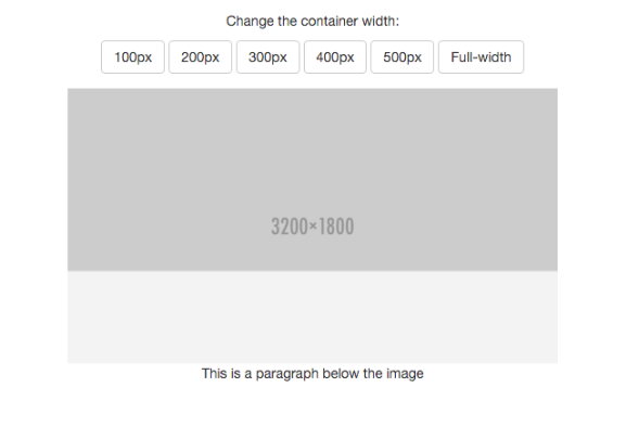
I added in a placeholder image sized at 3200×1800 and put it in a pen, take a look:
To prevent the responsive images from getting scaled beyond its original size, we wrapped the responsive container in an image-wrapper, with a max-width and max-height of 3200px and 1800px.
Testing if the page reflows
Obviously, you want to test how these images affect the loading of the page, but how would you do that? Your internet connection is probably pretty fast, so the images will load instantly, how would you test a slow connection?
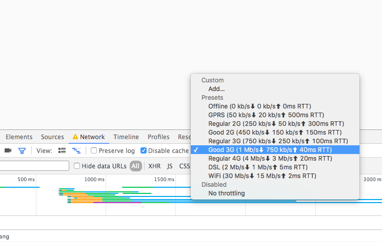
Chrome network throttler
In the Chrome devtools there’s a handy option called the network throttler. To use it, you want to open the devtools, switch to the network tab and click the throttling option.
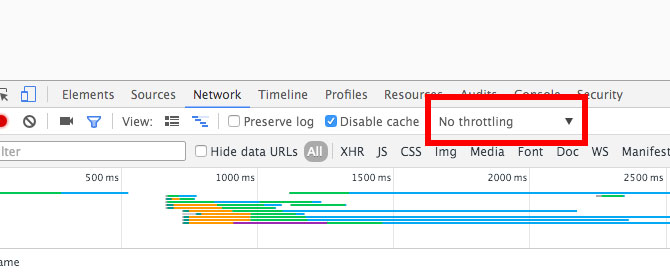
In here you get a wide range of network conditions, you can choose whichever you like, just make sure you test on a wide variety of conditions, instead of a single one.
Finally, reload the page, and you’ll notice that it becomes considerably slower. You’ll see the image starts to load, but the container has the entire space reserved on the page, that’s the result we’re after!
Resize your browser window and you’ll see that the reserved space matches the image exactly on every viewport width!
Dynamically calculating the aspect
In the example above we talked about the image with a 16/9 aspect ratio and we hard-coded these values in the CSS, but in reality your images will have various different aspects, so it’s pretty impossible to define every aspect in CSS.
Using PHP
We’ll end this blog post with an example on how to implement dynamic responsive images using the tricks explained above.
PHP has a built-in function called getimagesize and it returns an array with the width and height of the image.
To calculate the aspect dynamically, do the following:
|
1 2 3 4 5 6 7 8 9 10 |
<?php // Reference to the image $image = 'image.jpg'; // Get the width and height list($width, $height) = getimagesize($image); // Calculate the aspect, with 2 decimal points $aspect = round($height / $width * 10000) / 100; ?> |
And then, we want to output the structure and image in our HTML:
|
1 2 3 4 5 6 7 8 |
<!-- Set the max-width and max-height --> <div class="image-wrapper" style="max-width: <? echo $width ?>; max-height: <? echo $height ?>;"> <!-- Set the aspect % as the padding bottom --> <div class="responsive-container" style="padding-bottom: <? echo $aspect ?>%;"> <!-- Echo the image --> <img src="<? echo $image; ?>" alt="My responsive image" /> </div> </div> |
And there we have it, our dynamic responsive image which won’t cause a reflow when it loads. Enjoy!